Conducting competitor traffic analysis was the first step in identifying the final list of competitors for detailed research. We made a clear decision to analyze the top 3 competitors along with our current design.


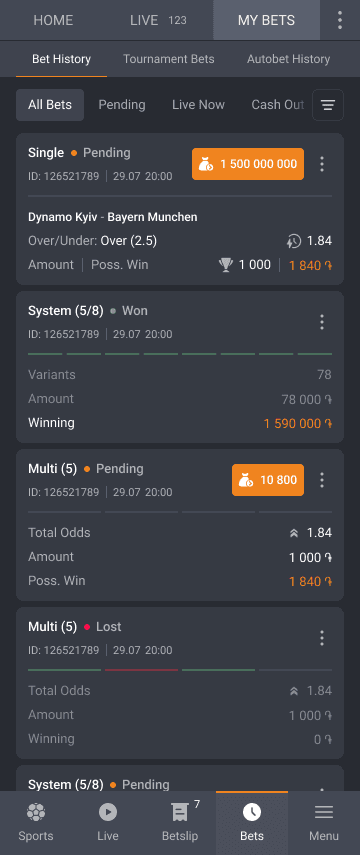
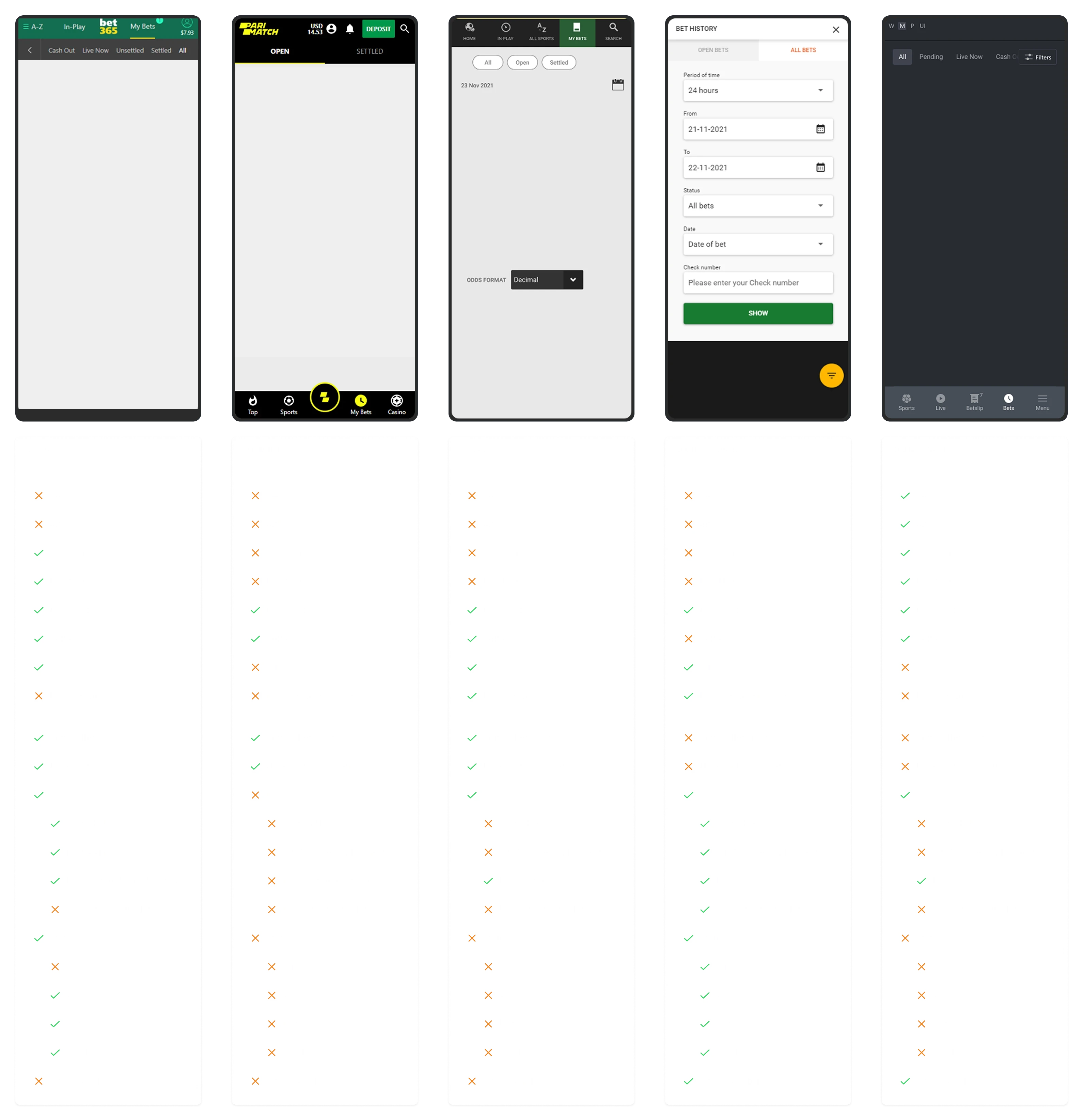
The first section focused on "Bet History." I decided to highlight all the key features available across the competitor websites and used icons to indicate which platforms offered each feature and which did not.
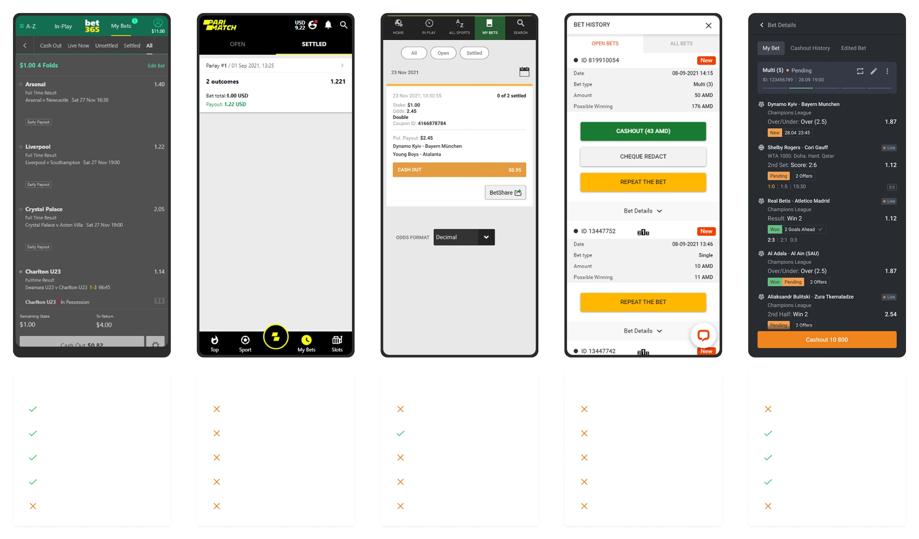
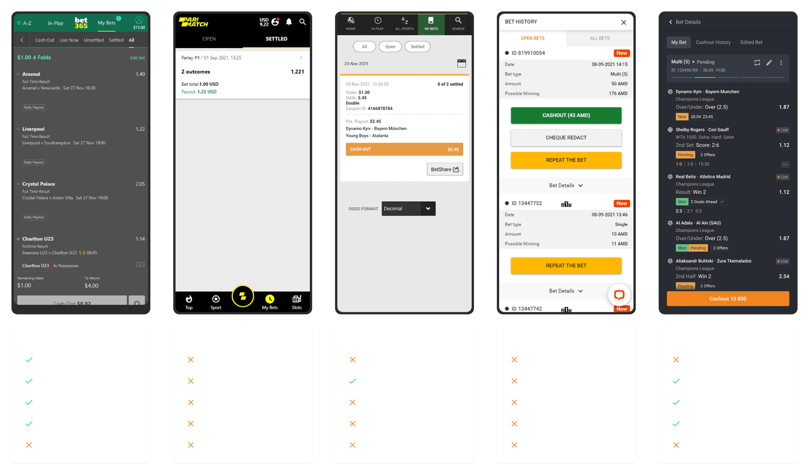
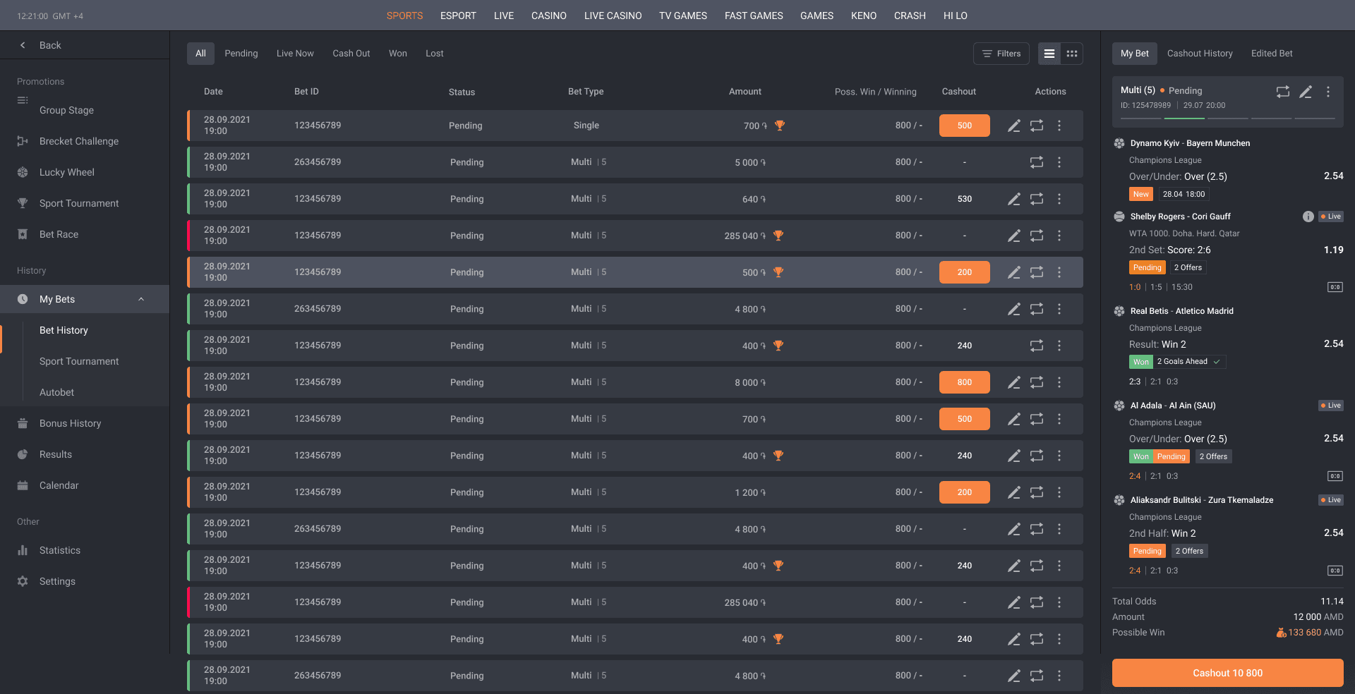
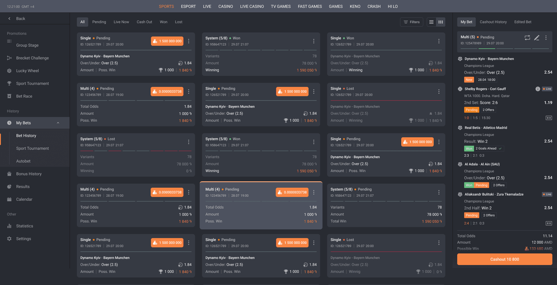
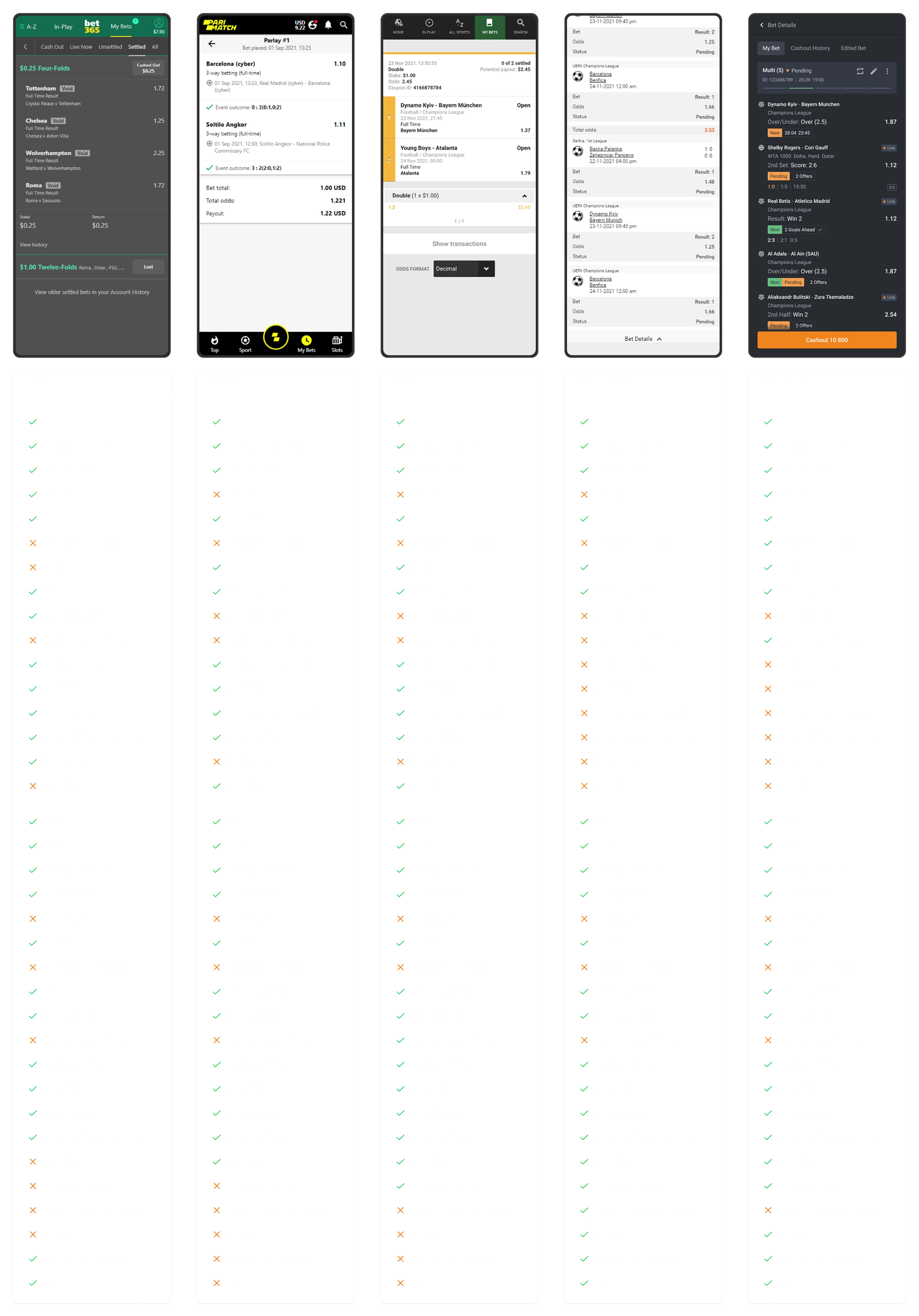
For the second step, I outlined all the actions users can take within the "Bet History" tab.

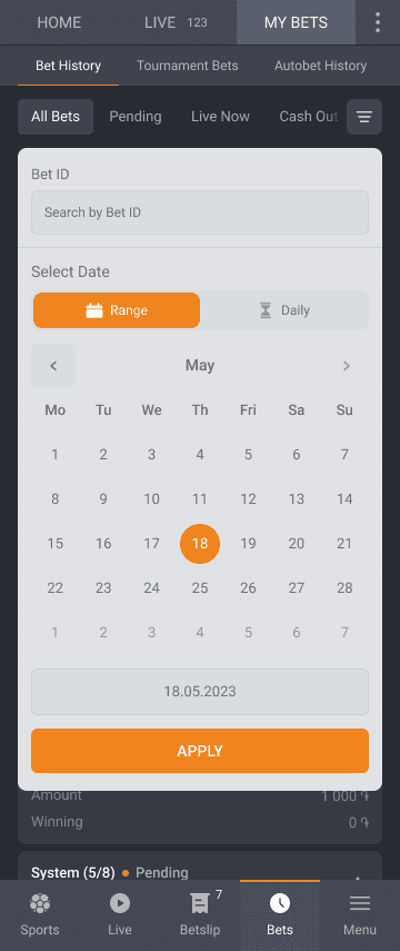
It’s crucial to highlight the types of filters used and how easily users can navigate and find the information they need. Understanding how much screen space is dedicated to filters—especially on mobile, where space is limited—is an important part of the analysis.

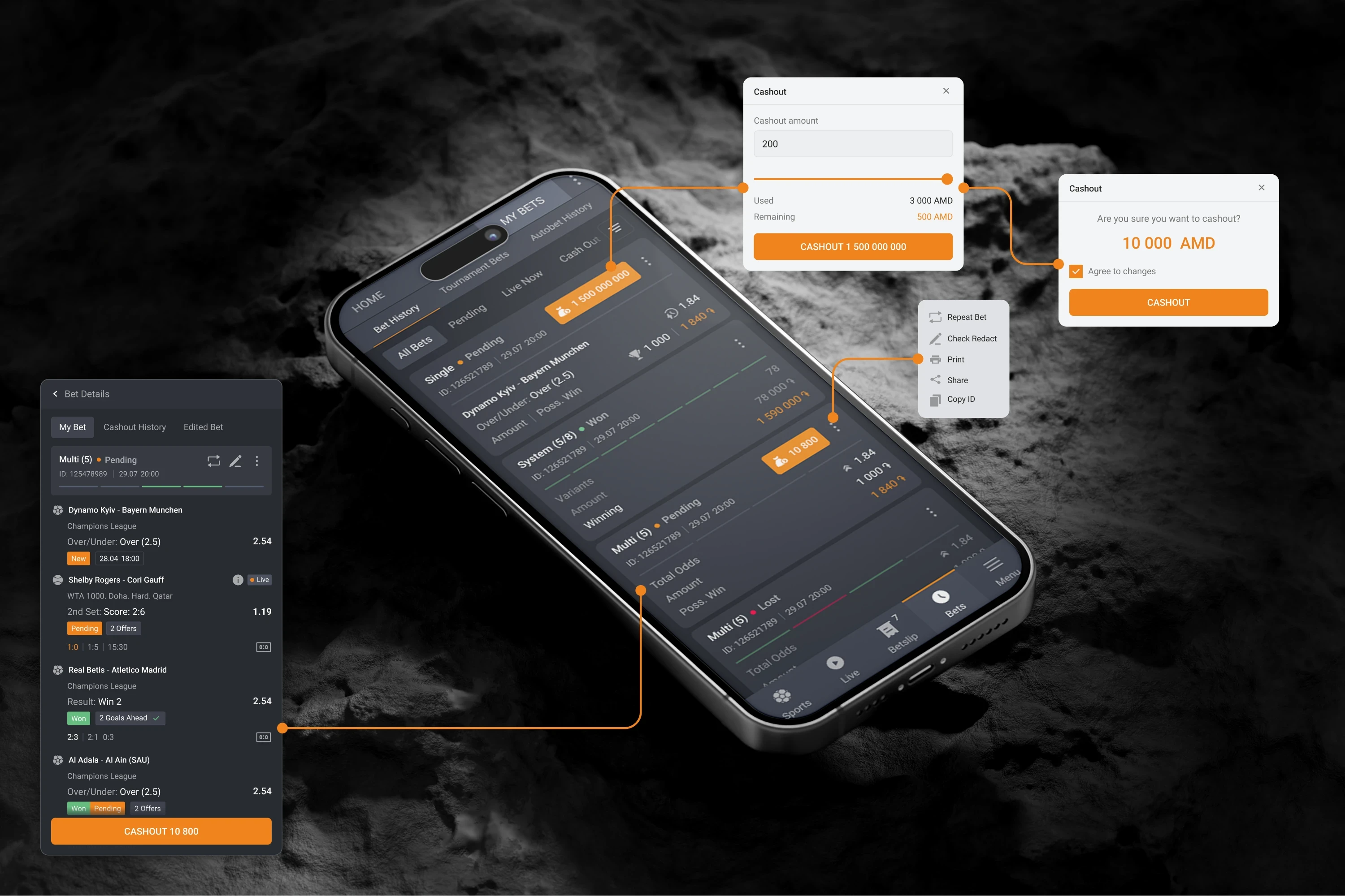
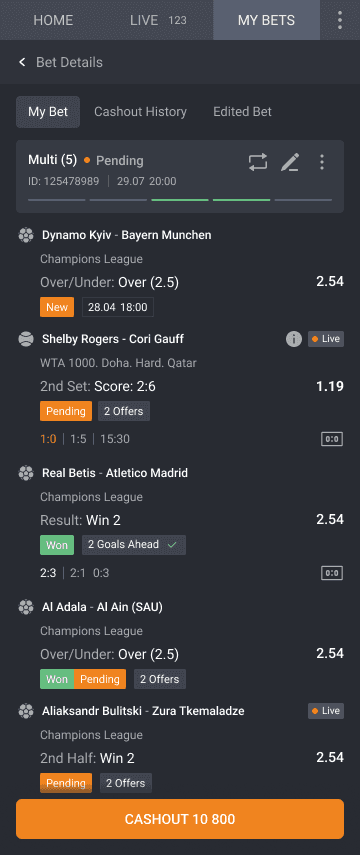
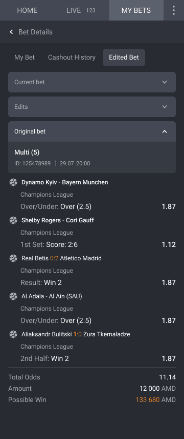
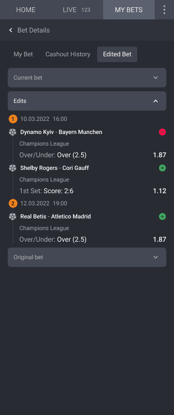
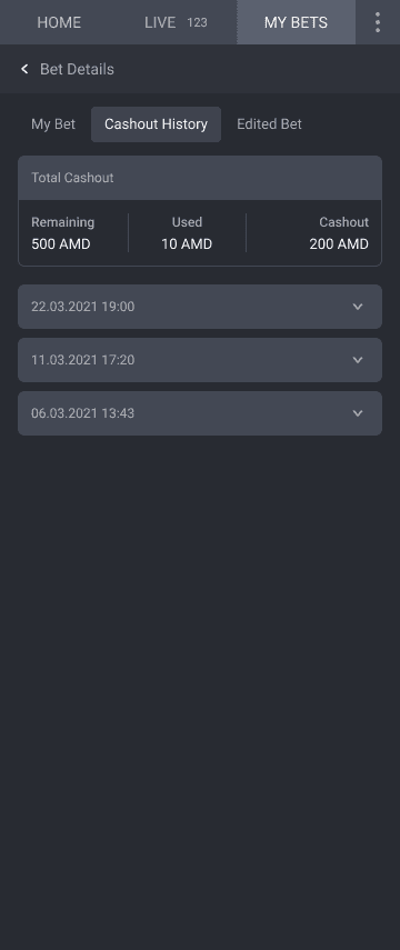
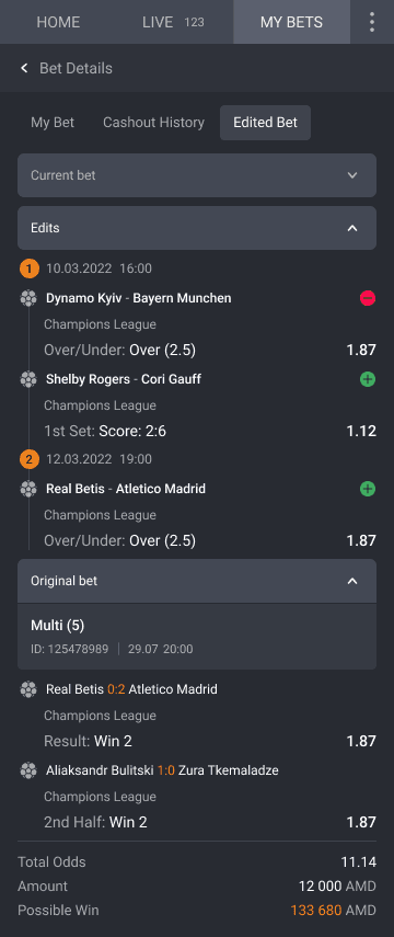
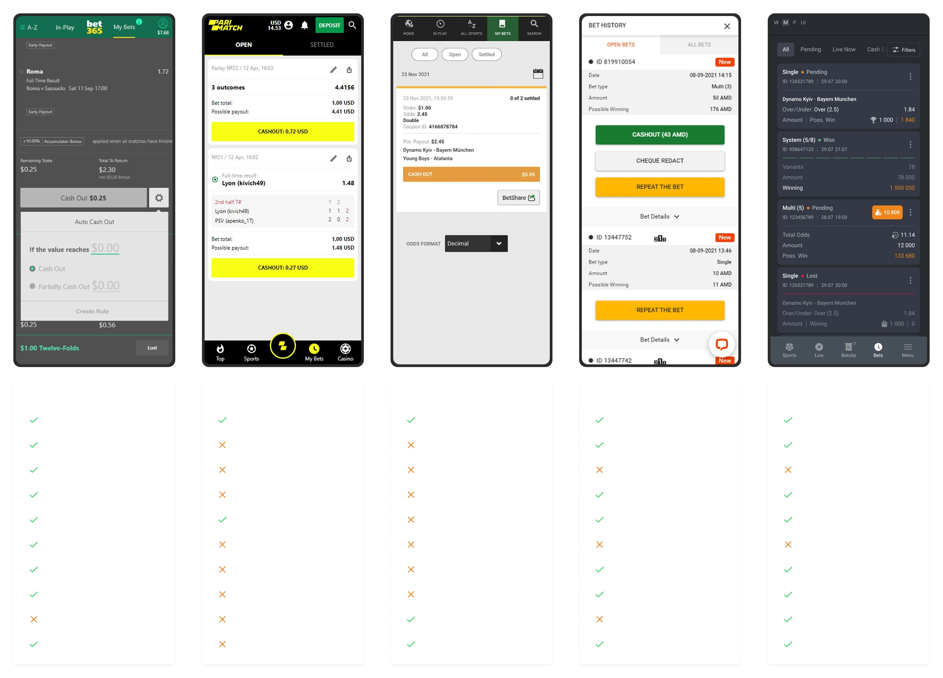
The “Bet Details” pages are the most complex ones users interact with—combining dense data and multiple actions in one view. Everything needs to be highly visible and easily clickable, while also saving space and adhering to UX heuristic principles.
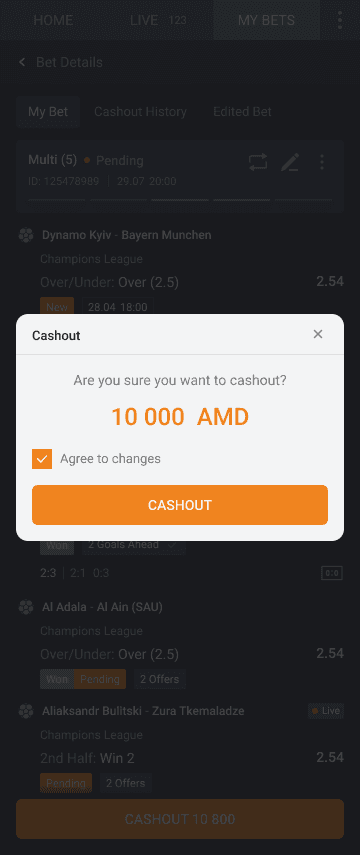
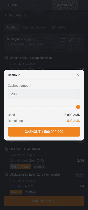
Partial Cashout
The Partial Cashout section is designed for users who don’t want to give up entirely but want to secure part of their winnings. It allows them to take a portion of their bet amount while leaving the rest active, in case they’re not 100% confident in winning and want to keep some stake in the game.